Production: Changing styles!
Welcome!
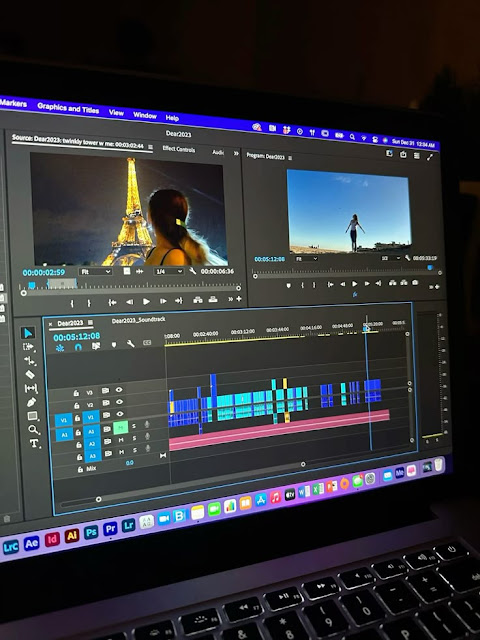
Today we will be discussing how I decided to change the font for my short film.
When I first started working on the project, I chose “Bodoni 72 Oldstyle” and “Chalkduster” as the primary fonts for the title and credits. At first glance, they seemed fitting. "Bodoni 72 Oldstyle" had an elegant, classic feel, while "Chalkduster" added a playful, handwritten element. However, as the project developed, I realized these fonts didn’t align with the vibe I wanted to create. Instead of conveying romance, the fonts gave off a more horror-like atmosphere.
The group and I noticed this during the early review stages. We discussed how the typefaces shaped the tone of the film. "Bodoni 72 Oldstyle" was too formal and stark, which paired with the script, felt eerie. "Chalkduster," while casual, had a rough and unsettling quality that leaned toward a thriller or horror genre. The realization hit me that the fonts were unintentionally misleading the audience.
After some reflection, I decided to make a switch to fonts that would better reflect the romantic and emotional tone of the story. I tested a variety of options before settling on "Segoe Print Bold" and "Verdana Bold." These fonts gave the title sequence and credits a much-needed sense of simplicity and warmth. "Segoe Print Bold" had a handwritten quality but felt more welcoming than "Chalkduster." Its smooth curves helped set a personal yet gentle tone.
On the other hand, "Verdana Bold" brought clarity and modernity. It was clean and easy to read, which complemented "Segoe Print Bold" perfectly. With this new combination, the film instantly felt more cohesive and visually in line with the romantic storyline. The fonts no longer distracted from the emotions I wanted to convey. Switching fonts wasn’t something I anticipated needing to do. Initially, I thought choosing fonts was a minor detail. However, I soon realized how crucial these choices were in setting the mood. The group and I could now focus on the story without the presentation feeling off. The transition to "Segoe Print Bold" and "Verdana Bold" was one of those small but impactful changes that transformed the overall feel of the project.
The new fonts allowed me to stay true to the romantic and reflective nature of the film. I’m glad I made the change when I did, as it prevented further confusion about the film’s genre. It’s incredible how typography can make such a big difference in how a story is received.
That's all for now.
Logging off!


Comments
Post a Comment