Welcome! I just finished editing my entire film, and I couldn't be more excited! It was such a journey from start to finish, but it's all finally come together. The group and I worked hard to make sure everything was as polished as possible, from the transitions to the sound design. After countless hours adjusting small details, the final cut looks exactly how I imagined. I spent a lot of time making sure the color grading was perfect for each scene, especially during the emotional moments. One of the most exciting parts was setting up the Wix website for the film. I wanted the website to match the film’s tone, so I went with a minimalistic, modern layout. It’s now the official hub for anyone interested in learning more about the project, and I’ve included behind-the-scenes footage and cast interviews. The hardest part was selecting the right theme, but after experimenting with different designs, I found one that felt just right. The poster card design also took some time, but ...
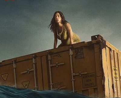
Hello viewers, I hope all is well. Today, I will be announcing my final decision on the genre for my opening sequence. The genre I decided to choose was thriller ! I believe it fits my pitch the most by making it suspenseful. I wanted my film to have a captivating opener that would hook the audience right away. I also wanted to create a tense atmosphere throughout the movie to keep the person watching on the edge of their seats. I will use elements of this genre to create an exciting and thrilling experience that will keep the audience guessing. For me, thriller is the most interesting genre. There has never been a thriller movie that has failed to satisfy me in wanting more and keeping me guessing until the very end. I can't wait to begin filming! Logging off!
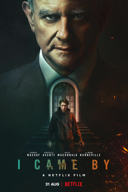
Hello! I hope all is well, let's get straight into the research! What elements (Conventions) of the genre that you chose to base your final task on does this movie have? Elements in this movie from the thriller genre that I am using in my final task are the tracking shot and the establishing shot. The tracking shot will be used to capture the suspense and tension of the movie while the establishing shot will be used to set the mood and tone. Both techniques are essential in creating the desired effect of my thriller movie. I will ensure that my final task creates similar tension to this movie by using these elements. What elements (Conventions) of the genre did the movie have that you like? Elements that I enjoyed in this movie were the use of pan and diegetic sounds. The pan and diegetic sounds gave the movie a more immersive experience. The movie also had a good soundtrack that added to the intensity of the movie. The editing was very well done, with a smooth flow that added to ...

Comments
Post a Comment