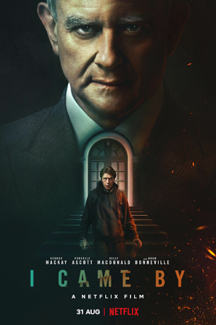
Welcome! I just finished editing my entire film, and I couldn't be more excited! It was such a journey from start to finish, but it's all finally come together. The group and I worked hard to make sure everything was as polished as possible, from the transitions to the sound design. After countless hours adjusting small details, the final cut looks exactly how I imagined. I spent a lot of time making sure the color grading was perfect for each scene, especially during the emotional moments. One of the most exciting parts was setting up the Wix website for the film. I wanted the website to match the film’s tone, so I went with a minimalistic, modern layout. It’s now the official hub for anyone interested in learning more about the project, and I’ve included behind-the-scenes footage and cast interviews. The hardest part was selecting the right theme, but after experimenting with different designs, I found one that felt just right. The poster card design also took some time, but ...

Comments
Post a Comment